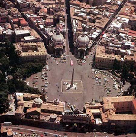

036 the second manSince city-building is a slow, unfolding process, getting it right depends not only on what we complete today, but the style we set, the tradition we establish for tomorrow-because whatever we do, some day someone is going to come around and fool with it. Edmund Bacon, in The Design of Cities, called this the 'principle of the second man'. To explain, Bacon gives the example of Rome's Piazza del Popolo. Here, the architectural interventions neatly bookend the first and the last of Baroque urban design: 
First, in the 1580's, the architects of Pope Sixtus V channel two new boulevards into this piazza at Rome's northern gate, the Porta Flaminia. Next, the new 'crow's foot' of streets gives architect Carlo Rainaldi the unprecedented idea of placing two nearly identical domed churches between them. Soon, the inevitable Egptian obelisk appears. Finally, under Napoleonic rule in 1813, Giuseppe Valadier is allowed to expand the piazza with his two hemispherical garden walls. Since ancient times, this corner of Rome was known for its gardens and orchards, and Valadier keeps the association alive with his Baroque façade and stair (on the left), leading to what has become a park, the Pincio. 
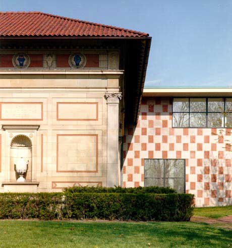
Looking back across the centuries, there seems to be a certain inevitability to the perfection of this piazza. But it did not have to happen. Rome was fortunate in having an extremely sophisticated manner of design, and keeping it intact for almost three centuries. Other piazzas, other cities, have not been so lucky. For us all, the survival of one man's vision depends on the builder who follows; over time a composition may be maintained, or altered, or ruined. Good outcomes depend on continuity, on shared and sustained ideas of what is fitting and right. Just as importantly, they require respect for what is already there. As Camillo Sitte expressed it, 'Today's city builder must, before all, acquire the noble virtue of an utmost humility—and what is remarkable in this case, less for lack of money than for psychological and purely objective reasons.' In an age when arrogance is part of the curriculum in every architectural school in the land, this is wise counsel. No one wants to be a second man today; each must be a pioneering genius, boldly pushing back the frontiers of art. Sixty years ago, the critic Siegfried Giedion was the first to diagnose the ailment. He called it 'playboy architecture', an architecture 'treated as playboys treat life, jumping from one sensation to another and quickly bored with everything'. Giedion wrote in a more innocent age, and he might be shocked to see the rationalizations the later generations of playboys have concocted to support their self-indulgences. A Los Angeles critic (in The Planning Report (L. A.) Aug 2002) quotes fashionable architect Rem Koolhaas, to the effect that the future will have nothing to do with he calls the 'fantasy of order', but instead 'a staging of uncertainty... obsessed with the reinvention of psychological space.' He sees this happening in Los Angeles, and continues: ' the effect of all this is to evoke a kind of metropolitan theater-a vast staging of uncertainty no longer explicable as a series of related happenings, but only comprehensible as the simultaneous occurrence of multitudinous events'. In tough times like ours, we should learn to recognize baby talk when we hear it. This has been a specialty of the architectural profession since even before Frank Lloyd Wright, and the availability of postmodernist jargon opened up entirely new horizons for it. We are offered manifestos in abundance, and in all of them you will hear the same cant about discontinuities and indeterminacies, hyperrealities and hierarchies, with an occasional heterotopology thrown in for luck. Most of us have learned by now that whenever we open an academic book to a discussion of 'space', we may safely close it again and put it back on the rack. This is the upmarket style of academic decadence, the mode of the big thinkers. It is empty, and fundamentally dishonest. At bottom, and despite the necromantic verbiage, it is the pop sensibility, inflicted not on our eardrums but on the streets where we live. In the above quote, Mr. Koolhaas seems to be excusing architects from all concerns of context. It is not clear what such a Koolhaas thinks of the communities where he builds, or their histories and characters; it is not clear whether he has noticed their existence. He is Doing his Thing. We've lost our balance, and we'll know we have it back when architects stop trying to bamboozle us with dialectic, and spend their time and effort crafting affectionate tributes not to themselves, but to the towns that will house their work. Some, of course, already do. Robert Venturi, for one, shocked the highbrow critics once again in the 70's, when he started designing museum additions that complimented the original buildings instead of trying to upstage them (Allen Art Museum, Oberlin, Ohio, National Gallery, London). 
Venturi, Scott Brown: Allen Art Museum, Oberlin, Ohio
The best 'second men' right now, however, are usually the small fry, the ones who create infill housing projects in recovering old neighborhoods. In cities coast to coast, these architects and builders put up homes and apartments that fit gracefully among their older neighbors. Architectural critics are uniformly dismissive of these. These homes are not edgy enough. There isn't a bit of titanium on them, and not one element painted in any shade of purple. But it's a wonderfully encouraging phenomenon, far more so than anything that makes the newspaper architectural columns. They build this way sometimes from personal commitment to the integrity of the neighborhoods-and failing that, because it is what buyers want. Examples of such serendipity in other kinds of building are still unfortunately rare. We might mention Manhattan's Battery Park City, where the city's Urban Development Commission first presented a street plan specifying open spaces, traffic arrangements and visual relationships to the existing area. All this was laid down in great detail, down to mandating the floor levels of setbacks for the new towers. Architect Cesar Pelli accepted the task, and not only was he able to meet all the requirements, but also the wider constraint of making an ensemble that looked like it belonged in downtown Manhattan, without merely copying styles from the past. The result: the biggest project of postwar Manhattan was also the greatest success. Compare that to the recent design competition for the reconstruction of Ground Zero, which assembled all the playboys of the globe. They offered New York picket fences in the sky, gargantuan oil derricks, spidery towers lifted from the covers of 50's science fiction paperbacks. The majority of the entrants were queerly distorted in one way or another: twisted, bent over, or chopped into weirdly intersecting glass planes. Architects of other ages tried to build many kinds of emotions into their works; anguish and incoherence were seldom among them. (Before the proposals disappear into the memory hole forever, you can see them on the site of the Lower Manhattan Development Corporation. ) There is always room for dramatic, one-off works, especially in a time when the blatant and eccentric is prized. Commissions for high-profile cultural institutions and skyscrapers can be welcome fields for experimentation. But on the whole, architects serve the city best when they are forced to act under constraints. This can mean many things beyond the responsibility of the 'second man': when they are forced to rely on local materials and methods, or assume styles or proportions consistent with the community's visual character; when they are forced to squeeze a building into an odd-shaped parcel of land that is slightly too small; when the money starts running short; when the community forces them to keep some fine old trees on the site. 
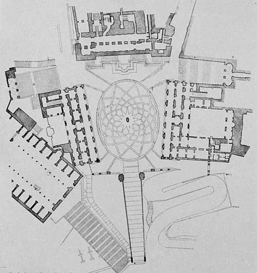
This is feeling the hand of the city's past on your shoulder. Accepting the role of the 'second man' often means the constraint of working between existing buildings, for aesthetic or practical reasons, or both. That little bit of humility didn't bother Michelangelo, who once faced a daunting task of working older buildings into a formal design. When he was commissioned to redesign Rome's dowdy, half-ruinous Capitoline Hill in 1538, he found two existing buildings facing each other at an odd angle, the Palazzo del Senatore (top center) and the Palazzo dei Conservatori (right). They had to be kept, so he remodeled them and rebuilt their facades (the Palazzo del Senatore is now Rome's city hall) and added a matching palazzo on the left side at the same angle to form an unusual trapezoidal open space. Around them he used architectural detail, a grand stairway, placement of statuary and a pavement done in a unique geometric pattern to create one of the world's great squares, the Piazza del Campidoglio. Michelangelo's only try at urban design turned out to be one of his greatest works; I do not know of a more spectacular example anywhere of how imagination can work with constraints to bring order out of chaos. 
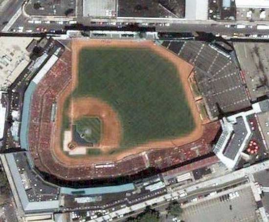
Any builder who can handle constraints with inspiration brings color and life into our towns. It's a pity that Michelangelo never had a chance to design a baseball park, but some unsung American engineer-architects did a pretty good job on their own. Everybody knows the Green Monster in Boston's Fenway Park. It wasn't put there facetiously. There is a street directly behind that wall; the builders did the best they could to squeeze the park onto a small, irregular block. The Monster gives Fenway its special flavor and personality, and it adds complexity to the strategy of both the Red Sox and their opponents. Similar land constraints shaped most of the old parks: the odd corners that turn doubles into triples, or outs at second, the short porches, or the eccentric rise in level in the outfield at Crosley Field in Cincinnati. The same principle works elsewhere, and in surprising ways-as in Seville's La Maestranza bullring, forced into a slightly oval shape by the surrounding buildings when it was built in 1760. The distortion doesn't affect the corridas at all, but it gave the place extraordinary acoustics-you can hear every rustle of the matador's cape. As in so many fields of architecture and design, these constraints disappeared in the postwar decades, as periods of giddy prosperity and architectural imposture coincided. Acres of city land by the dozen would be leveled for the new-style ballparks of the 60's: cookie-cutter round stadia with nearly-equal measurements in the outfield and outside the foul lines, cut off from city life and surrounded by vast tracts of parking. These unloved things are now disappearing nearly as fast as Modernist housing projects. Those of Philadelphia, Pittsburgh and Cincinnati have already met the dynamite men, while the turn of Houston's now-empty Astrodome could come at any minute. The game returned to sanity when team owners began to realize that baseball in a void was no fun. Baltimore's Camden Yards started a revolution in the 90's: a return to the old-style ballpark, inserted gracefully among existing streets and buildings. Now, almost all new parks are built this way. Owners, players and fans fairly rejoice in the quirks caused by the exigencies of the surrounding street plan, and sometimes they perhaps go too far-the new park in San Diego even includes an old warehouse, built into the outfield wall. Most of these parks have done wonders for revitalizing the streets around them. Instead of parking lots, there's life. |
|