
030 formal and informal design
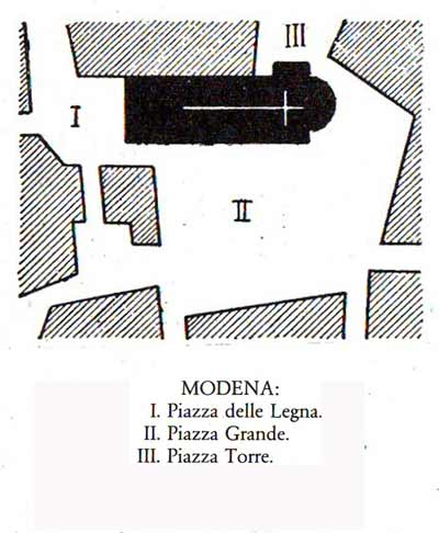
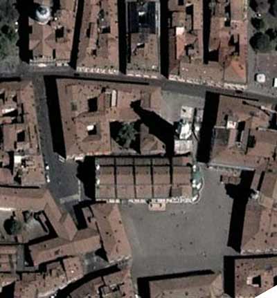
The 'system of piazzas' around Modena cathedral,
as sketched by Camillo Sitte (above), and in an aerial photograph. Such
systems were common in medieval Italian cities. To a modern eye, this
might seem an accidental, haphazard arrangement, hardly the most
artistic way of siting an important building. But a modern eye is not
necessarily a very sophisticated one.
Some of the aesthetic intent of this design is recounted below. But consider also the absolute economy it achieves in putting architecture at the service of the city. The cathedral was Modena's most important building, and in this plan its carved marble walls are able to embellish and define three distinct spaces, three 'rooms' of the city. Piazza della Legna (I), incorporating the cathedral façade, was used for ceremonies of a religious nature. Piazza Grande (II), the largest of the three, served as the stage for civic assemblies and other political events; the speaker's platform used by orators in the time when Modena was a free republic survives today (you can see it directly to the right of the cathedral's apse; the building behind it is the city hall) Piazza Torre (III) was a marketplace. At the centre of everything stands the church, the symbol of the community's faith. The mundane activities of city life clutch at her skirts all around. A design such as this allows us to truly see a community. Through art, the ephemeral and the enduring, the city of men and the city of stone, become one. 
We all know what the word 'symmetry' means-or do we? The Oxford English Dictionary gives first the original definition, the one understood in classical times, or in Shakespeare's England: 'Due or just proportion, harmony of parts with each other and to the whole'. That was a quality any educated man could appreciate in architecture as in nature. Greek temple, Gothic cathedral or Palladian villa, each was constructed according to a canon of proportions, and the true test of building was how successful architects were in evoking that mathematical harmony, the point where art and science meet. The 'symmetry' definition we know, the congruence of two or more sides around a central point or axis,only appears halfway down the page in the big dictionary. It is a relatively modern usage, employed by mathematicians and naturalists, and first recorded in the 1820's. Somehow, that very specialized meaning of the word has come to crowd out what was once a much larger and more profound conception. There's a reason for dragging in this piece of etymological trivia. If people think of urban design at all, they most likely imagine a grand, 'symmetrical' conception like the Mall in Washington, or Rockefeller Center, or Daniel Burnham's plan for Chicago. That is one manner of design. It goes back at least as far as Trajan's Forum in imperial Rome, an ensemble of public buildings that would look entirely at home in Washington today. After a thousand years in disfavor, it appeared again in the Renaissance rebuilding of Rome. Think of the Piazza del Popolo. (As a child, not yet knowing what it was, I was fascinated by this famous square, reproduced on the wallpaper of our neighborhood pizzeria.) Pilgrims and other travelers coming down the main road from the north would enter the city through the Porta Flaminia and immediately encounter the most gracious architectural welcome any city could offer. Facing them across the lovely, oval piazza were two lookalike domed churches, dividing a crow's foot pattern of three stately, die-straight streets that seem to radiate from the Egyptian obelisk at the piazza's center, beckoning newcomers to the three centers of the city: left for the Quirinale and Lateran, center for the Capitol, right for the Vatican. Here it is—benvenuti à Roma! 
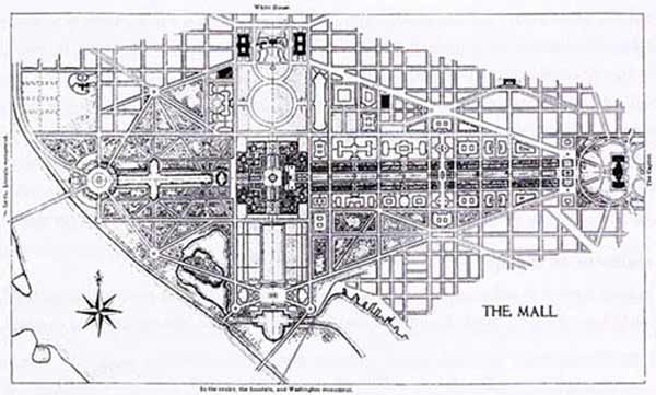
Formal design: Daniel Burnham's plan for the Capitol Mall in Washington
This geometrically-ordered manner, which we may call formaldesign, soon spread throughout Europe. Joined to a grid, sometimes overlaying it with grand diagonal avenues, it created the style of Baroque planning that reached its height with Pierre L'Enfant's plan for Washington. By the 19th century its triumph was complete, and when Frederick Law Olmsted and Daniel Burnham were laying out the Columbian Exhibition, men would have denied that any other kind of design existed. In fact there was one, older and more widespread, and at the the same time capable of greater subtlety and variety. The general opinion on this manner of design is perhaps best expressed in the well-known poem by G. K. Chesterton: Before the Roman came to Rye, or out to Severn strode, That ain't necessarily so. This forgotten art-we'll call it informal design- would be rediscovered in the medieval cities of Europe by a Viennese architect named Camillo Sitte. Sitte spent thirty years visiting the cities of Europe for his researches, and though not a scientific man, he definitely had a method. He would leave the station and ask for the address of the best bookstore, and when he found it he would ask three questions there: the tower with the best view, the best map, and the hotel with the best dinners. After that, there was nothing to do but wander around, make historical inquiries, sketch and take notes. The result was a book called The Artistic Principles of City Building (1889, Der Städtebau nach seinen künstlerischen Grundsätzen) On paper, the organization of formal design is plain and clear. But left on your own, in a city such as Washington, you might need many miles of walking to discover everything that could be grasped in seconds by looking at the paper plan. Informal design, as rediscovered by Sitte, is not conceived on paper; it creates its effect by what the eye sees on the street, and a paper plan can only give a hint of what's there. It is three dimensional; it depends on the masses, shapes and angles of buildings, the shapes and extents of open spaces, and the different conjunctions of these elements the eye takes in while moving among them. Sitte's famous drawings of the ground plans of medieval cathedral precincts in Der Städtebau do not in themselves show how these great exemplars of informal design work. Sitte is forced to call on the reader's imagination, and spend many pages of prose explaining the practical common sense behind the arrangements, and just how they would appear if you were observing them on the spot. Sitte often used the word malerisch, or 'picturesque', to describe these effects, which earned him the contempt of the Modernist critics, who accused him of promoting a sort of old-fashioned chocolate-box art. 'Malerisch', though, would in this context be translated better by something like 'painterly'. Informal design tries to create a composition, in the way a painter does. This is the manner that built the medieval town centers of Europe, where each year millions of tourists from all over the globe express delight at the 'picturesque' arrangements of streets and squares. Picturesque does not mean haphazard. Just as much thought and just as much art went into the design of medieval cities as anything before or since. The civilization that built the cathedrals knew a little about siting them too. Grasping the purpose behind informal design can be difficult for a modern mind, accustomed to paper plans and a simplistic sort of visual order. The men who employed it, whether in ancient Greece, or Byzantium, or Muslim Spain, or medieval Tuscany or early New England, did not write treatises about it, or lay down rules. It is something that comes naturally. Frankly, it's a lot like interior decorating. We arrange our furniture and hang our pictures in a way that is practical and looks good to us, and we know that every room presents a different challenge. Cities, of course, do not get arranged and decorated all at once. All the beautiful old towns we enjoy today were the work of many hands over many centuries. Formal design sometimes depends on this—Piazza del Popolo took several interventions over nearly 300 years to reach the form it has today. But informal design relies much more on a continuity of vision over time; it might almost be called a vernacular. And like vernacular architectures, it can show a remarkable endurance through the centuries. Sitte was perhaps the first to perceive and explore this feature of design, a hidden aesthetic that shaped European cities and maintained itself while adapting to the changes of the centuries. He suggests that such a process is at the heart of design everywhere, and expresses a further hope that it can not only be recognized, but instructed, cultured. In the words of his excellent translator and editor George Collins, Sitte 'searched for an inner structure, a hidden pattern, that allowed for unending change in response to the demands of historic time. Stating the obvious, he reminds us over and over that there is always such a thing as a 'system' of design, and that the one we have developed in our modern, traffic-choked towns is very different from those of the past. In the heyday of the City Practical, the most ignorant of Sitte's detractors accused him of being a reactionary, of ignoring technical advances while trying to impose outmoded rules from the past. One gets the sense that few, if any of them, actually read the book, but the prejudice against anything that smacked of 'art' in those days was strong. In Grady Clay's Close-up, the author accuses the poor fellow of killing off all life and spontaneity. Clay heard the phrase 'artistic principles', one suspects, and automatically assumed Sitte was laying down rules like some architectural doctor of the Beaux-Arts. Sitte himself was perfectly aware of the futility of slavishly copying the past, something he dismissed as an 'affected artlessness, a studied naturalness'. And he never had any intention of imposing rules, only studying the principles that had guided urban design in the past. In general, Sitte suggests there are no 'rules' as such. Rules come with formal design; classically-minded architects had been codifying them since the Renaissance. According to Leon Battista Alberti, the proper height for a buildings facing a square should be 'one third the breadth of the open area, or one-sixth at least'. But open spaces allow for almost infinite possibilites, in different climates, and under different cultures and traditions of architecture. After his account of the Italian design system, Sitte remarks: 'It seems questionable, however, whether we can expect the same principles to apply in the North. The climate, the life of the common people, the dwellings, and the type of construction there are substantially different; ought not the streets and plazas also be different?' In the end we are left with an ideal of diversity, where design finds its way by means of geography and culture, as opposed to the one-size fits-all dogmas of the Modernists. The much-misunderstood Mr. Sitte intends not to teach us how to build like the medieval Italians, but how to look closely at our own communities, and discover the genius loci waiting to emerge and blossom inside them. |
|